Check out this quick SVG viewport and viewBox tutorial. We’ll break down exactly what viewport and viewBox are in SVG for the web.
You’ll learn:
- The difference between SVG viewport and
viewBox - The aspects of your SVGs you can control with each
- How they are each applied
Let’s begin!
Viewport or viewBox?
Tuts+ instructor Adi Purdil explains how to use SVG viewport and viewBox in this video. Subscribe to the Tuts+ YouTube channel for more courses and explainers like this!
SVG Viewport
If you literally break down the word “viewport” you’ll get a hint as to its role in SVG. It creates a “port” through which you can “view” a section of an SVG. Imagine this as being something akin to a porthole window through which you can see the world beyond.


As with a window, the size of the viewport determines how much you can see. Yet it doesn’t define the size of whatever might be visible through that viewport. What’s on the other side could theoretically be any size at all.
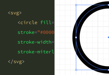
For example, you might have a shape in your graphic that is 100px by 100px. But, if you set the SVG viewport to 50px by 50px, you’ll only see a portion of that shape. The viewport size is set by adding width and height attributes to the svg element, like so:
In the first SVG, we see the entire 100px by 100px circle. In the second SVG, however, when we set our viewport size to 50px by 50px we only see a quarter of the circle.
SVG viewBox
The viewBox can be thought of as much like the viewport but with two extra features: it can “pan” and it can “zoom”. Building on the “looking through glass” analogy, if the viewport is like a window, the viewBox is like a telescope.


viewBox Parameters
Let’s talk about the SVG zoom. We control the viewBox by adding it as an attribute to the svg element, with a value comprising four space separated numbers:
1 |
viewBox = <min-x> <min-y> <width> <height> |
The first two numbers define the position of the viewBox, which we’ll think of as “panning”. The last two numbers define the dimensions of the viewBox, which we’ll think of as “zooming”.
SVG Zoom in viewBox
We’ll start by looking at “zooming”, which we can do with the last two viewBox parameters: width and height. We’ll leave the first two parameters at 0 0 for now.
If those last two SVG viewBox parameters have the same dimensions as the viewport, there’s no zooming in or out. This means nothing changes. Take a look SVG number 3 for example:
But if we make those two numbers larger than the viewport dimensions, we’ll effectively zoom out. And if we make them smaller, we’ll zoom in.
In SVG number 4 in the example above we’ve set the viewBox width and height to 100, which is double the size of our viewport. This “zooms out” and shows double the content, thereby revealing the entire circle.
In the fifth SVG our viewBox is set to a width and height of 25, which is half the size of our viewport. This SVG viewBox zoom “zooms in”, showing half the amount of content. All in all, the SVG zoom is pretty simple.
SVG Panning in viewBox
The first two viewBox parameters allow you to “pan” by setting where the upper left corner of the viewBox should be. The first number controls the horizontal position, and the second controls the vertical position.
- To pan right, increase the first number
- To pan left, decrease the first number
- To pan down, increase the second number
- To pan up, decrease the second number
Take a look at how this panning works in this example. To remind you, SVG number 3 has a 50 by 50 viewport, the viewBox is added but with no SVG zoom or panning. Number 6 is the same, but panned to the right and down:
viewBox Panning and Zooming Together
You can, of course, apply the SVG zoom and pan at the same time. Do it by using all four parameters at once, for example:
When Using viewBox, Set Your Viewport
Whenever you use the viewBox attribute, remember to set your viewport dimensions too. If you don’t, they’ll default to 100% and you’ll likely have an oversized graphic:
SVG Viewport and viewBox, in that order.
SVG viewBox and Viewport Explained in a Nutshell
Let’s recap SVG viewBox and Viewport into some bullet points:
- The viewport is like a window you look through to see an SVG’s content.
- The SVG
viewBoxis similar to the SVG viewport, but you can also use it to “pan” and “zoom” like a telescope. - Control the viewport via
widthandheightparameters on thesvgelement. - Control the viewBox by adding the attribute
viewBoxto thesvgelement. It can also be used on the elementssymbol,marker,patternandview. - The SVG
viewBoxattribute’s value is comprised of four space separated parameters. - The first two SVG
viewBoxparameters control “panning” and the last two control “zooming”. - Increase the first parameter to “pan” right, decrease it to “pan” left.
- Increase the second parameter to “pan” down, decrease it to “pan” up.
- Make the
viewBoxdimensions (the last two parameters) larger than those of the viewport to “zoom out”. To “zoom in”, make them smaller.
I hope that helps clarify the sometimes murky waters of SVG viewport and viewBox. Happy SVG creating!
Learn More About SVG and Web Design
We’ve explained SVG viewBox and viewport, its zoom parameters, and more. If you’d like to keep learning about SVG for web design, these are great resources:
-
 How to Hand Code SVG
-
SVG for Web Designers in 60 Seconds
-
How to Use “animateTransform” for Inline SVG Animation
-
HTML (Hypertext Markup Language)
-
How to Enhance Your Website Layouts With SVG Shapes
-
Animate an Icon With SVGator, Figma and Envato Elements
-
How to Make a Beating Heart Animation for St. Valentine’s Day With SVG
-
Accessible SVG: Methods for Adding Alternative Content


Recent Comments