
Today
Integrated navigation elements, interactive typography, and digital overprints are three website design trends making waves this month. Let’s take a look at each design trend with some fun examples.

If you are judging by website trends, designers are feeling quite creative right now. This month’s collection features a lot of neat interactive elements with some larger-than-life pieces that demand attention.
Add in some great details, and you’ve got a set of trends that are fun to design and create plenty of opportunities for users to interact with the content.
Here’s what’s trending in design this month:
1. Integrated Navigation
Sticky navigation styles – often anchored in a box along the top of the screen – have been dominant for some time. (And for good reason. They work in almost any use case.)
There is a shift, though, with navigation elements that are more integrated into the overall design. This is a little trickier because you have to have just the right image or video background to maintain readability and a methodology for what to do on the scroll.
When done well, integrated navigation is beautiful and elegant. It feels more like a magazine than a traditional homepage and can even spur some interaction.
Beca Tea integrates navigation into the background in a few ways. First, the logo is actually outside the navigation in the main hero area. With scattered white letters on a dark background, it makes it somewhat easier to create a navigation element across the top of the screen. A thin rule creates some natural separation. What’s most fun is the tea leaves that move on the screen and encroach into the space of the navigation. It’s a great touch!

Fervent Digital
does something rarely seen – right side, vertical navigation that’s integrated into the main image. A touch of interactivity with a wide hover circle and thin lines that animate out of the navigation help you make a choice to interact. On scroll, it all tucks away neatly into a hamburger menu in the same general location.

Pininfarina deploys an integrated navigation element similar to Beca Tea, only it is anchored at the bottom of the screen. (There’s also another menu tucked inside a hamburger icon at the top of the screen. The video reel is always dark in the lower third so that each of the navigation options are easy to read at all times.

2. Big, Interactive Typography
We love big type (and cannot lie)!
The latest iteration of the oversized typography trend pairs it with interactive elements or animation to create even more impact. There are many different ways to do this for your design.
Here are three examples we love to help you think about how you might try to make it work.
Miso Tone uses a large, art-style type treatment with an experimental typeface. While the text itself doesn’t move, almost everything around it has some interactivity. The mouse pointer/hover has a circle dot, the background type shifts and moves, and the photo/video area features constant motion. There’s also a news scroller at the bottom of the page. There’s plenty to look at, with a primary focus on the text.

Full Circle
doesn’t give you the chance to think about anything other than the type. The big, white letters animate onto the screen, and the colorful background stays in constant motion. There’s also a small scroll animation to help you experience the next level of the design.

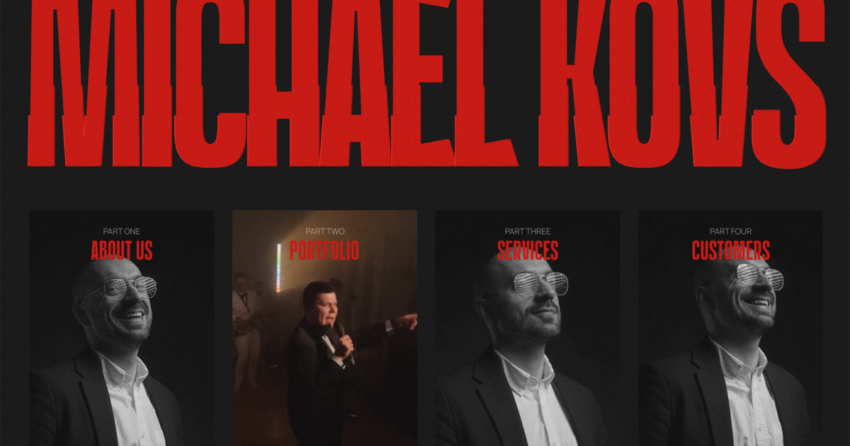
Michael Kovs leads with a loading video in which the big words grow until everything pops into a more static position. Then, the big letters have a bit of a glitch effect (also a trendy design element) that keeps motion at the forefront of the design. The design also uses a bit of unique navigation with boxes below the big words that pop you to other parts of the website quickly. While there is constant motion here, it plays simply enough that you don’t ever end up with that sea-sick feeling that often comes with sites that have too many animated effects.

3. Digital Overprint Styles
Overprint is one of those print design techniques that offers a lot of visual interest. When replicated online, it can have much the same effect.
When colors are overprinted, they interact with each other, blending and creating new hues or tones. Overprinting can be used to create richer colors or subtle shading effects. The resulting effect can be complex, and online, it mimics the effect of using multiple layers to highlight color and effect.
A digital overprint can also be controlled, allowing the designer to create whatever color options they want in the resulting artwork. Here, we’ll look at a more natural overprint, a dot matrix with overprint, and a fun black-and-white option.
Otis Bay Studio
uses animation with a fun digital overprint style to fill letters and merge color elements for added interest against the black-and-white outline. They balance it with softer gradients in text blocks and some interesting scroll effects.

Museum in the Village uses a dot gain style mixed with color to pull color together in a way that’s quite reminiscent of old print designs. The overprint style is carried throughout the scroll and the rest of the design to create a full theme in this style.

Scrib3 uses an outline and inline style to create an overprint effect without a lot of color. While the effect is somewhat stark, it is a nice take on a brutalist design with a bit more modern twist.

Conclusion
The one challenge with our collection of trends this month is that most of them are full design options. There aren’t a lot of pieces you can mix and match with existing frameworks without a significant amount of work.
These trends are great to consider when starting new projects or implementing a website facelift. Experiment and have fun with these ideas, and make them your own.




Recent Comments