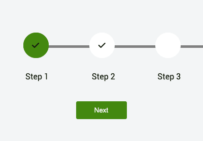

A progress stepper component is a tool added in forms to streamline user interaction by breaking tasks into manageable steps. It offers a straightforward navigation, visually tracks progress, and enhances the user experience.
This tutorial will cover building a progress stepper component with HTML, CSS, and JavaScript.
HTML Structure
The HTML structure will be made up of the following elements:
- Four circular div elements to represent the 4 steps in the navigation process.
- Two horizontal bars.
- Previous and Next buttons to navigate between the steps.
- A message component to display any info messages.
1 |
<div class="container"> |
2 |
<div class="progress-container"> |
3 |
<div class="progress-bar"></div> |
4 |
<div class="status-bar"></div> |
5 |
|
6 |
<div class="circle active"> |
7 |
<span> Step 1</span> |
8 |
<i class="fa-solid fa-check"></i> |
9 |
</div>
|
10 |
<div class="circle"> |
11 |
<span> Step 2</span> |
12 |
<i class="fa-solid fa-check"></i> |
13 |
</div>
|
14 |
<div class="circle"> |
15 |
<span> Step 3</span> |
16 |
<i class="fa-solid fa-check"></i> |
17 |
</div>
|
18 |
<div class="circle"> |
19 |
<span> Step 4</span> |
20 |
<i class="fa-solid fa-check"></i> |
21 |
</div>
|
22 |
</div>
|
23 |
<div class="buttons"> |
24 |
<button class="prev-btn">Previous</button> |
25 |
<button class="next-btn">Next</button> |
26 |
<button class="submit">Submit</button> |
27 |
</div>
|
28 |
</div>
|
29 |
|
30 |
<div class="message"> |
31 |
<i class="fa-solid fa-check"></i> |
32 |
<p>Your details have been submitted</p> |
33 |
</div>
|
Styling with CSS
Let’s start by applying the following styles to the body to ensure the contents will be centered.
1 |
body { |
2 |
min-height: 100vh; |
3 |
background-color: rgb(231, 233, 242); |
4 |
display: flex; |
5 |
justify-content: center; |
6 |
align-items: center; |
7 |
font-family: "Roboto", sans-serif; |
8 |
}
|
Then, we will have a container to hold all our elements:
1 |
.container { |
2 |
width: 700px; |
3 |
height: 300px; |
4 |
}
|
We will have another container that uses Flexbox to ensure the circles representing the different steps are spaced evenly along the horizontal axis.
1 |
.progress-container { |
2 |
width: 100%; |
3 |
display: flex; |
4 |
justify-content: space-between; |
5 |
margin: 50px auto; |
6 |
position: relative; |
7 |
}
|
Let’s make the div elements representing the steps circular by providing equal dimensions and a border-radius.
1 |
.circle { |
2 |
width: 50px; |
3 |
height: 50px; |
4 |
background-color: white; |
5 |
border-radius: 50%; |
6 |
position: relative; |
7 |
}
|
We also need to ensure that the icons are positioned at the center of the circles and the span is directly below its corresponding circle. By default, all the icons will be invisible.
1 |
.circle span { |
2 |
position: absolute; |
3 |
top: 150%; |
4 |
left: 9%; |
5 |
color: #141d0d; |
6 |
|
7 |
}
|
8 |
|
9 |
.circle i { |
10 |
position: absolute; |
11 |
top: 35%; |
12 |
left: 35%; |
13 |
display: none; |
14 |
|
15 |
}
|
By default, the first circle will have the icon visible and will also have a green background.
1 |
.circle.active i { |
2 |
display: block; |
3 |
}
|
4 |
|
5 |
.active { |
6 |
display: block; |
7 |
background-color: #43880f; |
8 |
}
|
The buttons will have the following styles.
1 |
.buttons {
|
2 |
display: flex; |
3 |
justify-content: center; |
4 |
align-items: center; |
5 |
position: relative; |
6 |
} |
7 |
button {
|
8 |
color: white; |
9 |
width: 100px; |
10 |
padding: 10px 20px; |
11 |
margin: 20px auto; |
12 |
border-radius: 3px; |
13 |
background-color: #43880f; |
14 |
border: none; |
15 |
} |
16 |
.next {
|
17 |
color: white; |
18 |
/* background-color: rgb(87, 87, 202); */ |
19 |
} |
20 |
.submit {
|
21 |
display: none; |
22 |
} |
23 |
button:disabled {
|
24 |
cursor: not-allowed; |
25 |
background-color: gray; |
26 |
} |
By default, the submit button will be hidden. It will be displayed when a user finishes all the steps required.
The horizontal bars (progress-bar and status-bar) will be positioned behind the circles. The first bar (.progress-bar) will be inactive, while the second bar (.status-bar) length will be animated depending on the user’s progress.
1 |
.progress-bar { |
2 |
width: 99%; |
3 |
height: 5px; |
4 |
background-color: grey; |
5 |
position: absolute; |
6 |
top: 50%; |
7 |
left: 0; |
8 |
|
9 |
z-index: -1; |
10 |
}
|
11 |
.status-bar { |
12 |
width: 100%; |
13 |
height: 5px; |
14 |
background-color: transparent; |
15 |
position: absolute; |
16 |
top: 50%; |
17 |
left: 0; |
18 |
z-index: -1; |
19 |
}
|
20 |
.animate { |
21 |
animation: fill 0.5s ease-in-out 0.4s forwards; |
22 |
}
|
23 |
|
24 |
@keyframes fill { |
25 |
100% { |
26 |
box-shadow: inset 0px 0px 0px 30px #43880f; |
27 |
}
|
28 |
}
|
Finally the message component will have the following styles and will be hidden by default:
1 |
.message { |
2 |
width: 500px; |
3 |
height: 300px; |
4 |
border-radius: 5px; |
5 |
border: 2px solid; |
6 |
gap: 10px; |
7 |
display: block; |
8 |
text-align: center; |
9 |
padding: 100px 5px; |
10 |
display: none; |
11 |
}
|
12 |
|
13 |
.message i { |
14 |
margin-bottom: 50px; |
15 |
font-size: 25px; |
16 |
padding: 20px 20px; |
17 |
background-color: rgb(230, 111, 196); |
18 |
border-radius: 50%; |
19 |
animation: fillIcon 0.8s ease alternate; |
20 |
}
|
21 |
@keyframes fillIcon { |
22 |
0% { |
23 |
transform: scale(1); |
24 |
}
|
25 |
100% { |
26 |
transform: scale(1.2); |
27 |
}
|
28 |
}
|
JavaScript Functionality
Time to get this thing working! The first thing we need to do is get the elements:
1 |
const progressBar = document.querySelectorAll(".progress-bar")[0]; |
2 |
const StatusBar = document.querySelectorAll(".status-bar")[0]; |
3 |
|
4 |
const circles = document.querySelectorAll(".circle"); |
5 |
const previousBtn = document.querySelector(".prev-btn"); |
6 |
const nextBtn = document.querySelector(".next-btn"); |
7 |
const submitBtn = document.querySelector(".submit"); |
8 |
const message = document.querySelector(".message"); |
Create a variable currentStepIndex to keep track of the currently active step in our progress component.
1 |
let activeStepperIndex = 0; |
Next, add a click event listener on the Next button. When the button is clicked, the currentStepIndex will increase by 1, effectively moving the progress indicator to the next step..
1 |
nextBtn.addEventListener("click", function () { |
2 |
activeStepperIndex++; |
3 |
updateStepper(); |
4 |
});
|
The UpdateStepper() function will display the check icon depending on the new value of the currentStepIndex.
Define a function called updateStepper().
1 |
function updateStepper() { |
2 |
circles.forEach((circle, index) => { |
3 |
const textI = circle.querySelector("i"); |
4 |
if (index === activeStepperIndex) { |
5 |
previousBtn.style.backgroundColor = "grey"; |
6 |
textI.style.display = "block"; |
7 |
circle.classList.add("animate"); |
8 |
}
|
9 |
if (activeStepperIndex === 3) { |
10 |
nextBtn.style.display = "none"; |
11 |
submitBtn.style.display = "block"; |
12 |
}
|
13 |
});
|
14 |
// previousBtn.disabled = activeStepperIndex === 0;
|
15 |
}
|
Inside the function, we will use the built-in forEach() method to iterate through each circle
- If the current index matches the
activeStepperIndex, we will display the check icon to the corresponding circle and also animate the circle. - If the
activeStepperIndexis the last, we will hide the Next button and display the submit button.
We also want to show the visual representation of the status bar. Update the event listener for the Next button, as shown below.
1 |
nextBtn.addEventListener("click", function () { |
2 |
activeStepperIndex++; |
3 |
console.log(activeStepperIndex); |
4 |
const percentageWidth = |
5 |
(activeStepperIndex / (circles.length - 1)) * 100; |
6 |
StatusBar.style.width = percentageWidth + "%"; |
7 |
StatusBar.style.backgroundColor = "green"; |
8 |
|
9 |
|
10 |
updateStepper(); |
11 |
previousBtn.disabled = true; |
12 |
});
|
The visual adds a green backgroundColor to indicate the progress made through the bar. The width is obtained by dividing the activeStepperIndex by the total number of steps (circles.length - 1 to adjust for zero-based indexing) and multiplying by 100 to get the value in percentage.
For example, if the step is at step 2, the width will be 33.3 %, and so on.
Finally, when the submit button is checked, we will display the message component to the user letting them know that their details have been successfully submitted.
Let’s add an event listener to the submit button .
1 |
const message = document.querySelector(".message"); |
2 |
const container = document.querySelector(".container"); |
3 |
|
4 |
submitBtn.addEventListener("click", function () { |
5 |
message.style.display = "block"; |
6 |
container.style.display = "none"; |
7 |
});
|
8 |
});
|
Inside the function, we are making the message component visible while hiding the stepper component.
Conclusion
In this tutorial, we have learned how to build a stepper component without any additional frameworks. Hopefully, you can now create even more advanced stepper components.


)
Recent Comments