
When text and animation merge, something truly captivating is created. And that’s why kinetic typography is an art form that goes beyond traditional typography and can transform static text into a dynamic, interactive experience.
What is Kinetic Typography?
Kinetic typography is the technique of animating text to make it move and change on screen in a variety of ways. This can range from subtle movements, such as letters that gently expand or contract, to more elaborate sequences where text flies across the screen, grows, shrinks, or changes in unexpected ways.
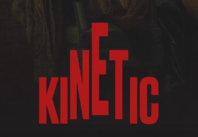
Take this Kinetic Typography template (for After Effects) over on Envato Elements as an example:


It’s simple, straightforward, and still pulls viewers in with the way the text appears dynamic and “alive.”
The beauty of kinetic typography lies in its versatility and its ability to capture attention. It can be used to convey emotions, emphasize messages, and create a more engaging and immersive experience for the viewer.


Though trending right now, the concept of kinetic typography isn’t new. It dates back to the 1950s with its first notable use in Alfred Hitchcock’s “North by Northwest.”

Today, kinetic typography is used extensively online. Its application ranges from website design to online advertisements, social media, and more. The key to effective use of kinetic typography is in the balance between the typeface, the motion, and the overall design.
Smooth, consistent motion, high contrast for readability, and thoughtful consideration of user experience ensure it looks good and effectively communicates the intended message.
Current Trends in Kinetic Typography
Kinetic typography, an already popular form of digital design, is trending in 2024. And how it’s being implemented is a bit different than how it’s been used in the past. Here’s some insight into what people are currently focusing on.
Interactivity
One of the most notable trends in kinetic typography right now is how it’s taken on greater interactivity and overall responsiveness — not in the “responsive design” sort of way, but rather, in a “this text reacts to what the user does” way.
So, the text moves, but it also reacts to user input and actions, offering an even more engaging user experience, according to Webflow. This trend is particularly visible in web design where typography responds to cursor movements, scrolls, or clicks.


The Delassus Group website offers a great example of this. It relies on horizontal parallax scrolling to deliver simple text and stylized animations that shift when you move the curser around.
Narrative-Driven Designs
Kinetic typography is increasingly being used to tell stories as well. Granted, this has always been a part of this typographic style but it’s finding increased relevant on on landing pages and in marketing campaigns.
It goes beyond mere decoration, in this regard, acting as a narrative device that guides the viewer through a story, be it a company’s history, a product’s features, or a campaign’s message.
Accessibility
Digital content is consumed globally, so making designs inclusive and accessible is more important than ever. Kinetic typography contributes to this by enhancing readability and comprehension. With careful design, animated text can be made easily readable and understandable, catering to a diverse audience including those with disabilities.
Though these designs should always be supplemented with appropriate alt text and keyboard-accessible navigation, however. Aesthetics should never be prioritized over functionality and accessibility.
Design Elements in Kinetic Typography
Before you explore creating kinetic typographic designs yourself, there are a few design aspects you should be aware of.
Integration with Other Design Elements
Kinetic typography in 2024 is not just about animated text in isolation. It’s about how this text works alongside other web design elements.
This includes combining dynamic text with advanced techniques like parallax scrolling — as we just mentioned above with the Delassus Group example — which adds a sense of depth to web pages.
Microinteractions, which are small, responsive design features that react to user input, are another way kinetic typography is being leveraged.


These elements work together to create an immersive experience for site visitors, turning a website into an interactive and engaging space. Features like these make people want to stay on your site for longer, and so long as they down impact site performance, you’re looking at a reduced bounce rate as a result.
Hero Typography
Oversized, animated text, particularly in the hero sections of websites, is another aspect of kinetic typography that is gaining popularity. This approach involves using large-scale text for brand names, headings, or key messages, making a bold visual statement the moment somebody lands on your website.
This technique is works because it’s about putting key messages front and center, ensuring they capture the viewer’s attention instantly.


Just look at the FirstFit website. It combines kinetic typography, large hero text, and parallax scrolling all into one.
Animation Techniques
Diverse animation techniques are being used as well to add depth and creativity to kinetic typography.
This includes methods like morphing, where text transforms in shape, liquid motion that gives a fluid, seamless quality to text, and animated collage, which combines various visual elements with typography to create a rich, layered effect.
Technical Aspects of Kinetic Typography
There are several technical aspects to consider when using kinetic typography in your designs to help ensure it looks and functions as intended. Here are a few things to keep in mind:
Font Choices
The selection of fonts and how they are paired plays a critical role in the success of kinetic typography.
It’s essential to choose font combinations that complement each other and enhance the overall design.
Key considerations include:
- Balancing a serif with a sans-serif for contrast
- Considering font weights for visual hierarchy
- Ensuring the fonts resonate with the intended message and audience
Also, readability should always be a priority, especially when motion is involved.
Look at what Angello Torres manages to accomplish with font choices on their portfolio site:


Color Impact
Colors in typography do more than just make the text look attractive. They profoundly impact UX and engagement. The right color choices can enhance readability, evoke emotions, and highlight key information.
Color choices can convey mood and align with brand identity, too. Understanding the psychology of colors and how they interact with typography is a must.
High contrast between text and background is essential for readability as well, especially when text is moving.
Tools and Software
Creating kinetic typography requires specific tools and software that allow for proper text animation.
There are a variety of user-friendly design tools available that cater to different skill levels and project requirements, so you won’t be short on options should you decide to create your own designs.
From Adobe After Effects, known for its comprehensive features and flexibility, to more accessible options like Creative Cloud Express or Canva, which offer simpler interfaces for basic animations, the choice of software can greatly influence the design process.
Choose something that aligns with your skill level and what you’d like to accomplish and you should be golden.
Will You Be Trying the Kinetic Typography Trend?
Kinetic typography in 2024 stands as a prime opportunity to create compelling, interactive, and engaging experiences. Since it’s been a prominent design option for years, it’s sure to remain a key player in shaping the way websites are constructed for the foreseeable future.
Whether for branding, storytelling, or creating immersive experiences, kinetic typography can deliver real creativity and connection to your site visitors. Will you be incorporating it into your next design?


Recent Comments