

Moving on from our previous article on defining and recognizing colors, let’s now explore the qualities and characteristics of colors.
We’ll cover the theory and emotional associations behind each color, explaining how people of different cultures respond to each one, and how you can use them effectively through color schemes in your designs. And, of course, we’ll show loads of website examples to demonstrate how this all works in the real world. Let’s begin with a strong one:
Red
A part of the warmer color family, the primary color red is a powerful, emotionally intense color.
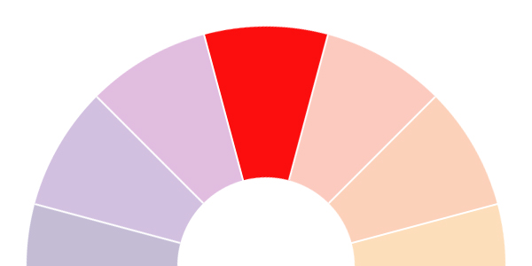
Naturally enhancing the metabolic rate in people, it has also been shown to increase respiration rates and blood pressure when people are exposed to it. It’s used in traffic systems a lot (think road signs and traffic lights) as red is a high-visibility color which has plenty of impact.
Some associations of the color red include:
- energy
- positivity
- action
- war
- danger
- strength
- courage, and
- all things intense and passionate
- love, sex, passion, desire
What is interesting about red is how it has two almost-direct opposite associations: love and war. Due to red being known as a high-impact color that often represents danger, it’s also associated with many memorable war images. However, red is known quite heavily for love and matters of the heart – with varying shades of red (from stronger, darker colors to lighter variations such as pink) being heavily associated with Valentine’s Day in Western culture.
In other cultures, red has completely different meanings. In China, red is associated with both prosperity and happiness, as well as being a symbol of good luck. In India, red represents purity and is then often used as a color used in many weddings. However, in South Africa red is the color used most in mourning.


Haar – for Designers, Artists and Illustrators
When using red, it’s often wise use it more as an accent color than a focal color for the whole of a website. While in some situations it works well as the main focal color, most of the time using too much red in a design can cause feelings of irritation, agitation and even anger. However, using too little red can also create a feeling of cautiousness and manipulation.
Owing to these two extremes, it can be quite difficult using red to build the right balance. However, using red as an accent color – particularly on features that you want to enhance or make particular note of, such as buttons or other elements that push a user to make a decision – can be quite effective.
Orange
Another color belonging to the warm family, orange is often seen as a bright, optimistic and uplifting color.
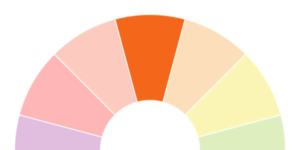
Both youthful and impulsive, orange often acts as a mental stimulant and is seen to be quite balancing.
Some associations of the color orange include:
- enthusiasm
- happiness
- gut reactions
- spontaneity
- adventure, risk-taking
- autumn (fall) and harvest
- creativity
- citrus
- healthy food
Orange is often seen associated with the third season in the yearly cycle: Autumn (or Fall). Due to the changing colors in the seasons, orange offers a warm transition from the brighter colors of summer before the harsher, cooler colors of Winter set in. Orange is also the main color associated with Halloween, which also takes places in the height of Autumn on October 31st.
As well as the associations with nature, orange is seen as a color which evokes enthusiasm and spontaneity in people. A color that encourages adventure and risk-taking, orange (due to its citric associations) also acts as an appetite stimulant, so may be useful in website designs where food or the appetite of the user is relevant.
And thinking about what we said earlier about a lot of the associations orange has with autumn and the transition between seasons – why not translate this into your designs, using orange as a color that offers transitions between two different areas of your design?
When using orange, it’s definitely useful to think of your target market and audience. When young people are your target audience, orange seems to be a popular color. As well as this, orange can be used to get people talking or thinking.
Yellow
The last of the main warm colors, yellow is a bright, creative color.

Known for its ability to promote clear thinking and quick decision making, yellow is probably most associated with happiness, positive energy and sunshine.
Some associations of the color yellow include:
- creativity
- sunshine
- happiness
- energy
- cowardice
- deceit
- warnings
- instability
- clarity
- activity
Yellow, one of the three primary colors, is seen chiefly as a happiness-invoking, creative color and can therefore be used effectively to create designs that evoke feelings of happiness and clarity.
A very energetic color, yellow also has a degree of activity that it can pass along in your designs. You can use yellow to create enthusiasm and enhance areas in your design that need action to be taken.
In other cultures yellow has wildly different associations and meanings. In Egypt, yellow is widely used as the color for mourning and in the Middle Ages, yellow clothing was worn to signify those that had died. In India, yellow is a color that is often used by merchants. And in Japan, yellow is a symbol of courage and therefore has positive associations.


Fierce – Bold Photography Theme
When designing with yellow, you need to be aware that using too much yellow can sometimes introduce feelings of anxiety – due to it being such a bright, “fast-moving” color too much yellow can lead to an unbalanced feel for your website. Instead, try to introduce other colors alongside yellow and use yellow as a highlight on a page, to lend focus to the more important aspects of a design.
However, due to the effects yellow has on a person (going back to the “fast-moving” sense it appears to offer), you can sometimes use yellow to your advantage – for example, yellow appears to induce quicker decision making and therefore having yellow buttons in e-commerce designs may work extremely well – as long as it is in fitting with the rest of your design.
Due to yellow feeling quite unstable it wouldn’t be a good idea to use yellow in a website where you want to invoke a feeling of stability or security. It also seems that historically men perceive yellow to be a childish color, so it wouldn’t be a good color choice for men’s product websites – though it would be right at home when used for a younger audience.
Green
Belonging to the cooler family of colors, green is a rejuvenating color and is often described as a natural peacemaker, due to its many associations with relaxing aspects of nature.

Some associations of the color green include:
- spring
- growth
- renewal & rebirth
- balance
- nature
- grass & gardens
- stability
- possessiveness
- jealousy
- envy
- fertility
- safety
- money
- recycling
A combination of blue and yellow, green offers the mental clarity and enthusiasm of yellow mixed with the more emotionally calm and stable blue. In nature, we see green around us all the time – in leaves, grass, flowers and much more. Because of this, a lot of the associations we have with the color green are related quite heavily to nature and similar themes such as rebirth and fertility.
Green is often referred to as a color that offers a sense of stability and balance. It could therefore work well to use green in designs where you want to show how a product or service is reliable or safe to use.
On the other side of the coin, green also has lots of associations with jealousy, envy, and possessiveness – so you need to be careful about how you use the colors and ensure you use green more to add balance to a website.
Green has strong links with the recycling market, with green being used in the major recycling logos in the UK and Europe alone. Therefore, it makes sense to use green in designs that relate to recycling or any “green” product, service or company.
In other cultures, green generally has good connotations. In Ireland, as well as appearing on the national flag, it’s a color that is heavily associated with St. Patrick’s Day. Green is also the color of the lucky four-leaf clover, which is probably the most well-known symbol of luck in the world. Green is the traditional color in Islam and is also mentioned in a good light a lot in the Quran, with many of those in Paradise described as wearing “green garments”.
Blue
The coolest of all the main colors, blue is often seen as a very reliable and tranquil color, most likely due to the most obvious association of blue with the sea and the sky.

A conservative color, it is often used well in designs that represent cleanliness and an air of responsibility.
Some associations of the color blue include:
- the sea
- the sky
- trust
- honesty
- loyalty
- sincerity
- peace
- tranquility
- intelligence
The final of the primary colors (alongside red and yellow), blue is a stress-reducing color that is often used in designs for masculine and corporate audiences. Blue is a color that invokes the feeling of trust, honesty and security and therefore lends itself well in particular to designs for products, services or companies that want to evoke those feelings in their audiences.
With its many associations with both the sky and the sea, blue also works well on designs that want to quite heavily promote those things. For example, if a product relates heavily to the sea (a surfing product, for example) then blue can be used to bring out those familiar feelings relating to the sea and help the audience relate to the product or website more. The same can be said for any colors that relate to actual, real things – such as anything in nature, like grass or flowers.


Innovio – Multipurpose Landing Page Theme
Blue is also known to be an appetite suppressor, so it wouldn’t be a suitable color to use in designs that involve food in some way. You also need to be aware how using too much blue can be stifling and can almost seem old-fashioned, depending on the shades used.
Some of the best times to use blue in your designs will be for websites that are focused on masculine audiences and also for corporate businesses. That isn’t to say you can’t use blue on other styles of design – don’t be afraid to experiment and have fun with using colors where you might not expect them.
Like with the general associations, there are many different connotations that come with the color blue in different cultures as well. In the Western culture, there is the “something blue” tradition, often used in weddings where the bride is offered something blue (as well as the other traditional “something old” and “something new”) as a token of good luck in her new married life. However, in Iran, blue is the color that is used in mourning.
Violet/Purple
The last of the cooler color family, purple is seen as quite a mysterious color, usually representing ambition, royalty and power.

Some associations with the color purple include:
- royalty
- imagination
- power
- luxury
- wealth
- extravagance
- ambition
- wisdom
- magic
- mystery
A good combination of both red and blue, purple is intriguing and has both the calming, tranquil effect of blue and the energy that red offers. Purple is often seen as a color of luxury and works well in designs that need to show that bit more of an extravagant edge to it.
Unlike blues and greens, purple is a rare color to come across in nature. For example, purple flowers such as lilies, orchids and lavender are rare to come across but are very fragile and delicate, yet very precious and treated with great respect.
Purple is a popular culture in many cultures, for many different reasons. In Thailand, purple is the color of mourning for widows whereas in Egypt, it is known widely as the favourite color of Cleopatra, who was the last pharaoh of Ancient Egypt. In many other cultures, purple is the traditional color worn by royalty or people with authority. And in the US, there is the “Purple Heart”, a significant US Military decoration awarded in the name of the President to those wounded or killed in battle.
When using purple, you need to be careful of using it too much – while certain amounts can definitely promote a more majestic, extravagant or luxurious feel to your design too much purple can also irritate and has even been heard to aggravate depression in some people.
It has been found that most children prefer the color purple to other colors, so it would likely be a really effective color to use in your designs that have a younger audience.
Using purple in your designs can be used to boost imagination or creativity and lighter shades of purple also work really well in feminine designs.
Color Schemes
Color schemes are an arrangement of colors that, once put together, can be used in any form of design – including your designs on the web. It’s hard work to come up with a good color scheme – and it’s easy to notice when colors feel or seem “off” or not quite right. However, when you do make the effort to create a good and effective color scheme – and you put it to good use – this will make all the difference between a good design and one that is mediocre.
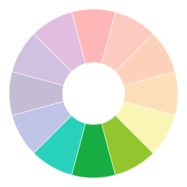
There are a few main color schemes, including: monochromatic, analogous, complementary, split complementary, triadic and tetradic.
Note: You might hear the next few terms used quite a bit when discussing color schemes. Here’s a handy little glossary to help you out if you need it:
- Hue: A “hue” is the color itself – so green, blue, red, purple, etc.
- Tint: A “tint” is when *white* is added to a hue, making that hue lighter.
- Shade: A “shade” is when you instead add *black* to a hue, making it darker.
- Tone: A tone is created when *grey* is added to a hue.
Monochromatic
Monochromatic color schemes use one hue (such as blue) and then use various tints or shades of that original color.

These are the easiest color schemes to create as it only involves the one hue – so you know that the few base colors you choose will work in harmony with one another.


Analogous
Analogous color schemes are created by choosing hues that are next to each other on the color wheel. So, for example, blue-green, green and yellow-green.
The easiest way to use an analogous color scheme is to choose one of the colors as the main, dominant color and then use the other two more sparsely, as accent colors to the first.


Complementary
Complementary color schemes are created by choosing two colors that are opposites on the color wheel – for example, red and green or purple and yellow. Because of these colors being exact opposites, they offer extremely high contrast and have a high impact.

Complementary color schemes can be hard to pull off for this reason and work better when you have elements of a design you want to stand out, rather than using them in fuller doses across the whole of a design.


Split Complementary
Split complementary color schemes are created by taking one color and then taking the two colors that are either side of what would be the first colors complementary.

For example, if your main color is purple, then your other two colors will be either side of the purple’s complementary color yellow – so yellow-green and yellow-orange.
As this color scheme is quite close to the complementary color scheme, it is still going to have quite the impact when used, though it can feel a little more balanced and calmer than full-on complementary schemes. Again, when using a split complementary color scheme it is easier to use one of the colors as the main focus, with the other two colors being used as an accent.
Triadic
Triadic color schemes use three colors that are evenly spaced around the color wheel, for example purple, orange and green.

Using triadic color schemes means you usually end up with quite a bright and vibrant color scheme, though this can be toned down slightly by using varying shades and tints of the colors. Like with the previous color schemes, triadic colors schemes work best when letting one color have more of a focus, with the other two working as accent colors.
Tetradic
Tetradic color schemes work by pairing up two sets of complementary color schemes. It almost works by almost creating a rectangle around the color wheel. An example of a tetradic color scheme is red, green, blue and orange.

What’s great about the tetradic color scheme is that it offers a lot of variety when it comes to choosing the colors that you use, and may offer you more ideas when you’re designing your website. Again, though, like with all of the other color schemes a tetradic color scheme works best by allowing one of the colors to be the focus, with the rest being used as accent colors.


Conclusion
That concludes our look at the characteristics of colors. In the next part of Design School for Developers, we’ll examine practical ways of choosing a color scheme.
Learn More About Color Theory
We have lots of color-related tutorials and articles on Tuts+, from color theory, to practical application in graphics and web design:


Recent Comments