
Yesterday
Welcome to February’s roundup of the best new fonts for designers. This month’s compilation includes some innovative variable fonts, a handful of revivals, and some excellent options for logo designers. Enjoy!

Gatch
Gatch is a modern take on the classic geometric sans. It uses wide and narrow glyphs to create an engaging texture. The variable font allows you to set the width of the uppercase straights, rounds, and diagonals to customize headlines without affecting the overall design.

Trust
Trust is a huge font family collection that offers three styles, from sans to serif, each with three levels of contrast and each again with eight weights, from light to black, and their italics. In total, there are 144 different fonts, giving you a huge palette to work with.

Occitanie
Occitanie is a single-weight vintage-inspired all-caps typeface with a distinctly Aegean feel. Some delightful swashes and ligatures lend it an air of lettering and make it an excellent option for a branding project.

ADB Detach
Everyone loves a good stencil font, and ADB Detach is a very good stencil font. True to the genre, it features sharp-cornered shapes and high contrast; unlike many stencil fonts, ADB Detach also has some expressive swashes that enable some brush script-like shapes.

Droulers Clarendon
Droulers Clarendon is a reworking of Droulers, adopting some of the more distinctive characteristics of Clarendons, particularly the relatively high contrast and the softening brackets on the serifs. I’m a big fan of the closed counter on the lowercase e.

Motorik
Motorik is a neo-grotesque, or modernist sans serif. It’s an excellent re-examination of type principles mid-way through the twentieth century, but unlike classic sans serifs of the period, Motorik works well on a screen thanks to 75 years of experience.

Baton Nouveau
Baton Nouveau is a reworked version of Baton, a sans serif designed for GQ France. It is a simple grotesque with subtle references to Art Nouveau in the slightly unexpected letter shapes. There’s a variable font available that covers seven weights, a condensed version, and italics.

Gravita
Gravita is an assertive typeface that oozes confidence. It blends classic proportions and a modern sensibility to create a sense of honesty and certainty. If there happens to be an election this year, here’s a great typeface for the winning candidate.

Dx Aiter
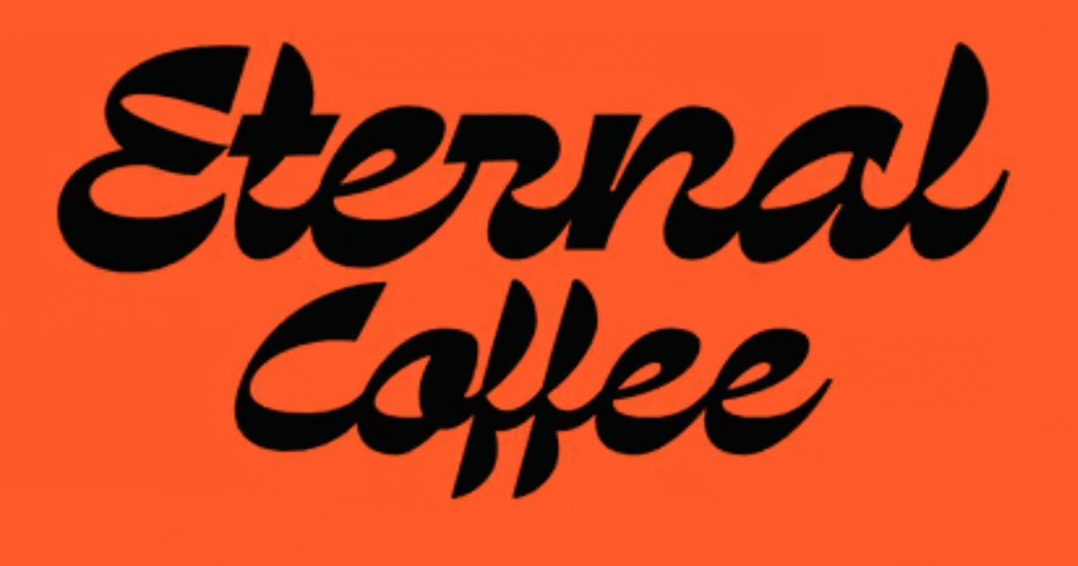
Dx Aiter immediately caught my eye this month because it attempts something new in the brush script genre. It has the same chunky, vintage appeal of many brush scripts but swaps the rounded terminals for sharp loops derived from vector artwork.

Hegissa
Hegissa is a charming didone that features semi-circular ‘bites’ taken from parts of the glyphs, most noticeably around the serifs — this gives the typeface a three-dimensional quality. It would be a great choice as the basis for a logo or for editorial design.

Das Grot
Das Grot is a modern typeface inspired by nineteenth-century grotesques. It adopts a less rigid skeleton than its sources to ensure a lively and engaging but sober text. Das Grot was initially designed in 2013 but has been reissued as a variable font.

Cabrio
Cabrio is a simple humanist sans serif that uses elements of geometric sans to create a warm and inviting corporate typeface. It has a particularly appealing poster weight with added character. Seven weights and their accompanying italics are available.

Kessler
Kessler comes in Text, Display, and Super Display styles. It’s an elegant serif font with moderate contrast and modest serifs. There are several weights, accompanying italics, and even a monospaced option for UI design.

Zhicco Mippa
Zhicco Mippa is a lovely, chunky graffiti-style typeface with fine, linear counters — the overall effect is vintage European signage. It’s crying out to be used as a logotype, possibly for a trendy apparel brand.

Corela
If you read this series regularly, you’ll know I have a soft spot for typefaces with liquid-style ripples through them. Corela is a great example, especially its uppercase. The letter shapes evoke mixed Latin and Moorish traditions in Portugal and Southern Spain.

Ben Moss
Ben Moss has designed and coded work for award-winning startups, and global names including IBM, UBS, and the FBI. When he’s not in front of a screen he’s probably out trail-running.


Recent Comments