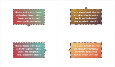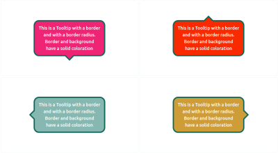
I hope you were able to spend time getting familiar with the techniques we used to create tooltips in Part 1 of this quick two-parter. Together, we were able to create a flexible tooltip pattern that supports different directions, positioning, and coloration without adding any complexity whatsoever to the HTML.
We leveraged the CSS border-image property based on another article I wrote while applying clever clip-path tricks to control the tooltip’s tail. If you haven’t checked out that article or the first part of this series, please do because we’re jumping straight into things today, and the context will be helpful.
So far, we’ve looked at tooltip shapes with triangular tails with the option to have rounded corners and gradient coloration. Sure, we were able to do lots of things but there are many other — and more interesting — shapes we can accomplish. That’s what we’re doing in this article. We will handle cases where a tooltip may have a border and different tail shapes, still with the least amount of markup and most amount of flexibility.
Before we start, I want to remind you that I’ve created a big collection of 100 tooltip shapes. I said in Part 1 that we would accomplish all of them in these two articles. We covered about half of them in Part 1, so let’s wrap things up here in Part 2.
The HTML
Same as before!
<div class="tooltip">Your text content goes here</div>
That’s the beauty of what we’re making: We can create many, many different tooltips out of the same single HTML element without changing a thing.
Adding a border to the tooltips we made in Part 1 is tricky. We need the border to wrap around both the main element and the tail in a continuous fashion so that the combined shape is seamless. Let’s start with the first simple shape we created in Part 1 using only two CSS properties:
.tooltip {
  /* tail dimensions */
  --b: 2em; /* base */
  --h: 1em; /* height*/

  /* tail position */
  --p: 50%;

  border-image: fill 0 // var(--h)
    conic-gradient(#CC333F 0 0);
  clip-path:
    polygon(0 100%, 0 0,100% 0, 100% 100%,
      min(100%, var(--p) + var(--b) / 2) 100%,
      var(--p) calc(100% + var(--h)),
      max(0%, var(--p) - var(--b) / 2) 100%);
}
Here’s the demo. You can use the range slider to see how flexible it is to change the tail position by updating the --p variable.
See the Pen [Fixing the overflow issue](https://codepen.io/smashingmag/pen/mdoLRVr) by Temani Afif.
The border property is not an option here as far as adding borders to our tooltip. It won’t work. Instead, we need to use a pseudo-element that effectively traces the shape of the main element, then makes it smaller.
Let’s start with the following code:
.tooltip {
  /* tail dimensions */
  --b: 2em; /* base */
  --h: 1em; /* height*/

  /* tail position  */
  --p: 50%;

  border-image: fill 0 // var(--h)
    conic-gradient(#5e412f 0 0); /* the border color */
  clip-path:
    polygon(0 100%, 0 0, 100% 0, 100% 100%,
      min(100%, var(--p) + var(--b) / 2) 100%,
      var(--p) calc(100% + var(--h)),
      max(0%, var(--p) - var(--b) / 2) 100%);
  position: relative;
  z-index: 0;
}
.tooltip:before {
  content: "";
  position: absolute;
  inset: 8px; /* border thickness */
  border-image: fill 0 // var(--h)
    conic-gradient(#CC333F 0 0); /* background color  */
  clip-path: inherit;
}
The pseudo-element uses the same border-image and clip-path property values as the main element. The inset property decreases its size from there.
See the Pen [Adding border to the tooltip](https://codepen.io/smashingmag/pen/yLwjqQw) by Temani Afif.
I’d say this looks great at first glance. But things get funky once we start adjusting the tail position. This is because the two clip-path shapes are not aligned since the pseudo-element is covering a smaller area than the main element. We need to keep the left and right values equal to 0 in order to fix this:
inset: 8px 0;
And let’s adjust the border-image to decrease the size of the colored area from the sides:
border-image: fill 0 / 0 8px / var(--h) 0
  conic-gradient(#CC333F 0 0); /* background color  */
Yes, it’s the border-image trickery from before! So, If you haven’t already, please read my article about border-image to see how we arrived here.
Now things are looking very good:
See the Pen [Fixing the clip-path alignment](https://codepen.io/smashingmag/pen/mdoLGEx) by Temani Afif.
The two clip-path shapes are nicely aligned. The tooltip is almost perfect. I say “almost” because there is a small issue with the border’s thickness. The thickness around the tail shape is a little smaller than the one around the element. If you play with the tail dimensions, you’ll see the inconsistency.

This probably is not that a big deal in most cases. A few pixels aren’t a glaring visual issue, but you can decide whether or not it meets your needs. Me? I’m a perfectionist, so let’s try to fix this minor detail even if the code will get a little more complex.
We need to do some math that requires trigonometric functions. Specifically, we need to change some of the variables because we cannot get what we want with the current setup. Instead of using the base variable for the tail’s dimensions, I will consider an angle. The second variable that controls the height will remain unchanged.

The relationship between the base (--b) and the angle (--a) is equal to B = 2*H*tan(A/2). We can use this to update our existing code:
.tooltip {
  /* tail dimensions */
  --a: 90deg; /* angle */
  --h: 1em; /* height */

  --p: 50%; /* position */
  --t: 5px; /* border thickness */

  border-image: fill 0 // var(--h)
    conic-gradient(#5e412f 0 0); /* the border color */
  clip-path:
    polygon(0 100%, 0 0, 100% 0, 100% 100%,
      min(100%, var(--p) + var(--h) * tan(var(--a) / 2)) 100%,
      var(--p) calc(100% + var(--h)),
      max(0%, var(--p) - var(--h) * tan(var(--a) / 2)) 100%);
  position: relative;
  z-index: 0;
}
.tooltip:before {
  content: "";
  position: absolute;
  inset: var(--t) 0;
  border-image: fill 0 / 0 var(--t) / var(--h) 0
    conic-gradient(#CC333F 0 0); /* the background color */
  clip-path: inherit;
}
Nothing drastic has changed. We introduced a new variable to control the border thickness (--t) and updated the clip-path property with the new variables that define the tail’s dimensions.
Now, all the work will be done on the pseudo-element’s clip-path property. It will no longer inherit the main element’s value, but it does need a new value to get the correct border thickness around the tail. I want to avoid getting deep into the complex math behind all of this, so here is the implementation:
clip-path:
  polygon(0 100%, 0 0, 100% 0, 100% 100%,
    min(100% - var(--t), var(--p) + var(--h)*tan(var(--a)/2) - var(--t)*tan(45deg - var(--a) / 4)) 100%,
    var(--p) calc(100% + var(--h) + var(--t)*(1 - 1/sin(var(--a)/2))),
    max(var(--t), var(--p) - var(--h)*tan(var(--a)/2) + var(--t)*tan(45deg - var(--a)/4)) 100%);
It looks complex because it is! You don’t really need to understand the formulas since all you have to do is adjust a few variables to control everything.
Now, finally, our tooltip is perfect. Here is an interactive demo where you can adjust the position and the thickness. Don’t forget to also play with the dimension of the tail as well.
See the Pen [Tooltip with border and solid color](https://codepen.io/smashingmag/pen/zYbjeop) by Temani Afif.
Gradients And Rounded Corners
We learned in Part 1 that working with gradients using this approach is pretty great because we’re already supplying a gradient on the border-image property. All we need to do is fill the main element and tail with a real gradient instead of a solid color.

Let’s move on to the rounded corners. We can simply use the code we created in the previous article. We duplicate the shape using a pseudo-element and make a few adjustments for perfect alignment and a correct border thickness.

The reason I’m not going into details for this one is to make the point that you don’t have to remember all the various use cases and code snippets by heart. The goal is to understand the actual concepts we are using to build the tooltips, like working with border-image, clip-path(), gradients, and math functions.
I can’t even remember most of the code I write after it’s done, but it’s no issue since all I have to do is copy and paste then adjust a few variables to get the shape I want. That’s the benefit of leveraging modern CSS features — they handle a lot of the work for us.
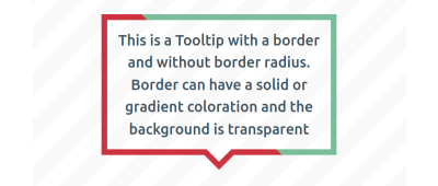
I’d like to do one more exercise with you, this time making a tooltip with no fill but still with a full border around the entire shape. So far, we’ve been able to reuse a lot of the code we put together in Part 1, but we’re going to need new tricks to pull this one off.
The goal is to establish a transparent background while maintaining the border. We’ll start without rounded corners for the moment.

See how we’re going to be working with gradients again? I could have used a single color to produce a solid, single-color border, but I put a hard stop in there to demonstrate the idea. We’ll be able to create even more variations, thanks to this little detail, like using multiple colors, different color stops, and even different types of gradients.
You’ll see that the code looks fairly straightforward:
.tooltip {
  /* tail dimension */
  --a: 90deg; /* angle */
  --h: 1em; /* height */

  --p: 50%; /* tail position */
  --b: 7px; /* border thickness */

  position: relative;
}
.tooltip:before {
  content: "";
  position: absolute;
  inset: 0 0 calc(-1*var(--h));
  clip-path: polygon( ... ); /* etc. */
  background: linear-gradient(45deg, #cc333f 50%, #79bd9a 0); /* colors */
}
We’re using pseudo element again, this time with a clip-path to establish the shape. From there, we set a linear-gradient() on the background.
I said the code “looks” very straightforward. Structurally, yes. But I purposely put a placeholder clip-path value because that’s the complicated part. We needed to use a 16-point polygon and math formulas, which honestly gave me big headaches.
That’s why I turn to my online generator in most cases. After all, what’s the point of everyone spending hours trying to suss out which formulas to use if math isn’t your thing? May as well use the tools that are available to you! But note how much better it feels to use those tools when you understand the concepts that are working under the hood.
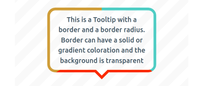
OK, let’s tackle rounded corners:

For this one, we are going to rely on not one, but two pseudo-elements, :before and :after. One will create the rounded shape, and the other will serve as the tail.

The above figure illustrates the process for creating the rounded part with the :before pseudo-element. We first start with a simple rectangular shape that’s filled with a conic gradient containing three colors. Then, we mask the shape so that the inner area is transparent. After that, we use a clip-path to cut out a small part of the bottom edge to reserve space for the tail we’ll make with the :after pseudo-element.
/* the main element */
.tooltip {
  /* tail dimension */
  --a: 90deg; /* angle */
  --h: 1em; /* height */

  --p: 50%; /* tail position  */
  --b: 7px; /* border thickness */
  --r: 1.2em; /* the radius */

  position: relative;
  z-index: 0;
}

/* both pseudo-elements */
.tooltip:before,
.tooltip:after {
  content: "";
  background: conic-gradient(#4ECDC4 33%, #FA2A00 0 66%, #cf9d38 0);  /* the coloration */
  inset: 0;
  position: absolute;
  z-index: -1;
}

/* the rounded rectangle */
.tooltip:before {
  background-size: 100% calc(100% + var(--h));
  clip-path: polygon( ... );
  mask: linear-gradient(#000 0 0) content-box, linear-gradient(#000 0 0);
  mask-composite: exclude;
  padding: var(--b);
}

/* the tail */
.tooltip:after {
  content: "";
  position: absolute;
  bottom: calc(-1 * var(--h));
  clip-path: polygon( ... );
}
Once again, the structure is not all that complex and the clip-path value is the tough part. As I said earlier, there’s really no need to get deep into an explanation on it when we can use the points from an online generator to get the exact shape we want.
The new piece that is introduced in this code is the mask property. It uses the same technique we covered in yet another Smashing article I wrote. Please read that for the full context of how mask and mask-composite work together to trim the transparent area. That’s the first part of your homework after finishing this article.
Fun Tail Shapes
We’ve covered pretty much every single one of the tooltips available in my collection. The only ones we have not specifically touched use a variety of different shapes for the tooltip’s tail.
All of the tooltips we created in this series used a simple triangle-shaped tail, which is a standard tooltip pattern. Sure, we learned how to change its dimensions and position, but what if we want a different sort of tooltip? Maybe we want something fancier or something that looks more like a speech or thought bubble.

If the rounded corners in the last section are the first part of your homework, then the next part is to try making these tail variations yourself using what we have learned together in these two articles. You can always find the code over at my collection for reference and hints. And, leave a comment here if you have any additional questions — I’m happy to help!
Conclusion
I hope you enjoyed this little series because I sure had a blast writing it. I mean, look at all of the things we accomplished in a relatively short amount of space: simple rectangular tooltips, rounded corners, different tail positions, solid and gradient backgrounds, a bunch of border options, and finally, custom shapes for the tail.
I probably went too far with how many types of tooltips we could make — there are 100 in total when you count them up! But it goes to show just how many possibilities there are, even when we’re always using the same single element in the HTML.
And, it’s great practice to consider all of the different use cases and situations you may run into when you need a tooltip component. Keep these in your back pocket for when you need them, and use my collection as a reference, for inspiration, or as a starting point for your own work!
Further Reading On SmashingMag
(gg, yk)


Recent Comments