
As an occasionally competent software developer, I love good documentation. It explains not only how things work but why they work the way they do. At its best, documentation is much more than a guide. It is a statement of principles and best practices, giving people the information they need to not just understand but believe.
As soft skills go in tech land, maintaining documentation is right up there. Smashing has previously explored design documents in a proposal context, but what happens once you’ve arrived at the answer and need to implement? How do you present the information in ways that are useful to those who need to crack on and build stuff?
Documentation often has a technical bent to it, but this article is about how it can be applied to digital design — web design in particular. The idea is to get the best of both worlds to make design documentation that is both beautiful and useful — a guide and manifesto all at once.
An Ode To Documentation
Before getting into the minutia of living, breathing digital design documentation, it’s worth taking a moment to revisit what documentation is, what it’s for, and why it’s so valuable.
The documentation describes how a product, system, or service works, what it’s for, why it’s been built the way it has, and how you can work on it without losing your already threadbare connection with your own sanity.
We won’t get into the nitty-gritty of code documentation. There are plenty of Smashing articles to scratch that itch:
However, in brief, here are a few of the key benefits of documentation.
Less Tech Debt
Our decisions tend to be much more solid when we have to write them down and justify them as something more formal than self-effacing code comments. Having clear, easy-to-read code is always something worth striving for, but supporting documentation can give essential context and guidance.
Continuity
We work in an industry with an exceptionally high turnover rate. The wealth of knowledge that lives inside someone’s head disappears with them when they leave. If you don’t want to reinvent the wheel every time someone moves on, you better learn to love documentation. That is where continuity lies.
Prevents Needless Repetition
Sometimes things are the way they are for very, very good reasons, and someone, somewhere, had to go through a lot of pain to understand what they were.
That’s not to say the rationale behind a given decision is above scrutiny. Documentation puts it front and center. If it’s convincing, great, people can press on with confidence. If it no longer holds up, then options can be reassessed, and courses can be altered quickly.
Documentation establishes a set of norms, prevents needless repetition, allows for faster problem-solving, and, ideally, inspires.
Two Worlds
In 1959, English author C. P. Snow delivered a seminal lecture called “The Two Cultures” (PDF). It is well worth reading in full, but the gist was that the sciences and the humanities weren’t working together and that they really ought to do so for humanity to flourish. To cordon ourselves off with specialisations deprives each group of swathes of knowledge.
“Polarisation is sheer loss to us all. To us as people and to our society. It is at the same time practical and intellectual and creative loss […] It is false to imagine that those three considerations are clearly separable.”
— Charles Percy Snow
Although Snow himself conceded that “attempts to divide anything into two ought to be regarded with much suspicion,” the framing was and remains useful. Web development is its own meeting of worlds — between designers and engineers, art and data — and the places where they meet are where the good stuff really happens.
“The clashing point of two subjects, two disciplines, two cultures — two galaxies, so far as that goes — ought to produce creative chances.”
— Charles Percy Snow
Snow knew it, Leonardo da Vinci knew it, Steve Jobs knew it. Magic happens when we head straight for that collision.
A Common Language
Web development is a world of many different yet connected specialisations (and sub-specialisations for that matter). One of the key relationships is the one between engineers and designers. When the two are in harmony, the results can be breathtaking. When they’re not, everything and everyone involved suffers.
Digital design needs its own language: a hybrid of art, technology, interactivity, and responsiveness. Its documentation needs to reflect that, to be alive, something you can play with. It should start telling a story before anyone reads a word. Doing so makes everyone involved better: writers, developers, designers, and communicators.
Design documentation creates a bridge between worlds, a common language composed of elements of both. Design and engineering are increasingly intertwined; it’s only right that documentation reflects that.
Design Documentation
So here we are. The nitty-gritty of design documentation. We’re going to cover some key considerations as well as useful resources and tools at your disposal.
The difference between design documentation, technical documentation, and a design system isn’t always clear, and that’s fine. If things start to get a little blurry, just remember the goal is this: establish a visual identity, explain the principles behind it, and provide the resources needed to implement it as seamlessly as possible.
What should be covered isn’t the point of this piece so much as how it should be covered, but what’s listed below ought to get you started:
The job of design documentation is to weave all these things (and more) together. Here’s how.
Share The Why
When thinking of design systems and documentation, it’s understandable to jump to the whats — the fonts, the colors, the components — but it’s vital also to share the ethos that helped you to arrive at those assets at all.
Where did this all come from? What’s the vision? The guiding principles? The BBC does a good job of answering these questions for Global Experience Language (GEL), its shared design framework.
On top of being public-facing (more on that later), the guidelines and design patterns are accompanied by articles and playbooks explaining the guiding principles of the whole system.
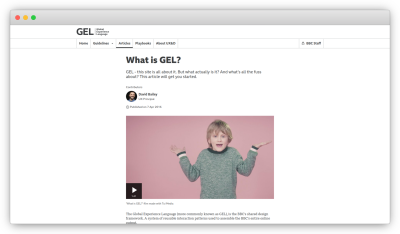
Include proposal documents, if they exist, as well as work practices. Be clear about who the designs are built for. Just about every system has a target audience in mind, and that should be front and center.
Cutting the guiding principles is like leaving the Constitution out of a US history syllabus.
Make Its Creation Is A Collaborative Process
Design systems are big tents. They incorporate design, engineering, copywriting, accessibility, and even legal considerations — at their best anyway.
All of those worlds ought to have input in the documentation. The bigger the company/project, the more likely multiple teams should have input.
Use Dynamic Platforms
The days are long gone when brand guidelines printed in a book are sufficient. Much of modern life has moved online, so too should guidance for its documentation. Happily (or dauntingly), there are plenty of platforms out there, many with excellent integrations with each other.
Potential resources/platforms include:
There can be a chain of platforms to facilitate the connections between worlds. Figma can lead into Storybook, and Storybook can be integrated directly into a project. Embrace design documentation as an ecosystem of skills.
Accommodate agile, constant development by integrating your design documentation with the code base itself.
Write With Use Cases In Mind
Although the abstract, philosophical aspects of design documentation are important, the system it described is ultimately there to be used.
Consider your users’ goals. In the case of design, it’s to build things consistent with best practices. Show readers how to use the design guidelines. Make the output clear and practical. For example,
- How to make a React component with design system fonts;
- How to choose appropriate colors from our palette.
As we’ve covered, the design breaks down into clear, recognizable sections (typography, color, and so on). These sections can themselves be broken down into steps, the latter ones being clearly actionable:
- What the feature is;
- Knowledge needed for documentation to be most useful;
- Use cases for the feature;
- Implementation;
- Suggested tooling.
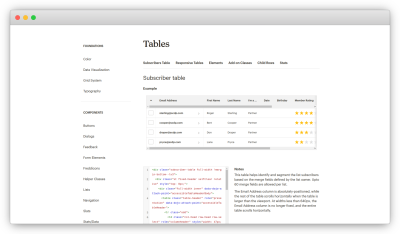
The Mailchimp Pattern Library is a good example of this in practice. Use cases are woven right into the documentation, complete with contextual notes and example code snippets, making the implementation of best practices clear and easy.
Humanising Your Documentation, a talk by Carolyn Stranksy, provides a smashing overview of making documentation work for its users.
Documentation should help people to achieve their goals rather than describe how things work.
As StackOverflow founder Jeff Atwood once put it, “A well-designed system makes it easy to do the right things and annoying (but not impossible) to do the wrong things.”
“Use Case Driven Documentation” by Tyner Blain is a great breakdown of this ethos, as is “On Design Systems: Sell The Output, Not The Workflow” by our own Vitaly Friedman.
Language
The way things are said is important. Documentation ought to be clear, accessible, and accepting.
As with just about any documentation, give words like ‘just’, ‘merely’, and ‘simply’ a wide berth. What’s simple to one person is not always to another. Documentation should inform, not belittle. “Reducing bias in your writing” by Write the Docs gives excellent guidance here.
Another thing to keep in mind is the language you use. Instead of using “he” or “she,” use “one,” “they,” “the developer,” or some such. It may not seem like a big deal to one (see what I did there), but language like that helps reinforce that your resources are for everyone.
More generally, keep the copy clear and to the point. That’s easier said than done, but there are plenty of tools out there that can help tidy up your writing:
- Alex, a tool for catching insensitive, inconsiderate writing;
- Write Good, an English prose linter.
In a previous Smashing article, “Readability Algorithms Should Be Tools, Not Targets,” I’ve shared a wariness about tools like Grammarly or Hemingway Editor dictating how one writes, but they’re useful tools.
Also, I can never resist a good excuse to share George Orwell’s rules for language:
- Never use a metaphor, simile, or other figure of speech that you are used to seeing in print.
- Never use a long word where a short one will do.
- If it is possible to cut a word out, always cut it out.
- Never use the passive where you can use the active.
- Never use a foreign phrase, a scientific word, or a jargon word if you can think of an everyday English equivalent.
- Break any of these rules sooner than say anything outright barbarous.
Books like The Elements of Style (PDF) by William Strunk Jr are good to be familiar with, too. Keep things informative but snappy.
Make It Beautiful
Design documentation has a lot more credibility if it’s walking the walk. If it looks like a hot mess, what are the chances of it being taken seriously?
Ideally, you should be showcasing a design ethos, not just explaining it. NASA showed way back in 1976 (PDF) that manuals can themselves be beautiful. The Graphics Standards Manual by Richard Danne and Bruce Blackburn feels like a creative work in its own right.
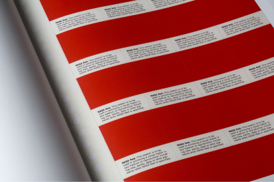
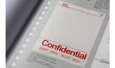
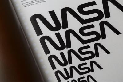
Show the same care and attention to detail in your design documentation that you expect users to show in applying it. Documentation should be the first and best example of it in action.
Make your documentation easy to navigate and search. The most wonderful resources in the world aren’t doing anyone much good if they can’t be found. It’s also a splendid opportunity to show information architecture best practice in action too.
Publish it
Once you’ve gone through the trouble of creating a design system and explaining how it works, why keep that to yourself? Publishing documentation and making it freely available for anyone to browse is a fantastic final polish.
Here at the Guardian, for example, our Source design system Storybook can be viewed by anyone, and its code is publicly available on GitHub. As well as being a proving ground for the system itself, it creates a space for knowledge sharing.
Here are just a few fantastic examples of publicly available design documentation:
There are plenty more where these came from in the Design Systems Gallery — a fantastic place to browse for inspiration and guidance.
What’s more, if there are stories from the formation of your system, writing articles or blog posts are also totally legit ways of documenting it. What did the New York Times do when they developed a design system? They wrote an article about it, of course.
Publishing design documentation — in all its forms — is a commitment, but it’s also a statement of purpose. Why not share something beautiful, right?
And Maintain It
This is all well and good, I hear you say, arms crossed and brow furrowed, but who’s going to keep all this stuff up to date? That’s all the time that could be spent making things.
I hear you. There are reasons that Tweets (Xs?) like this make the rounds from time to time:
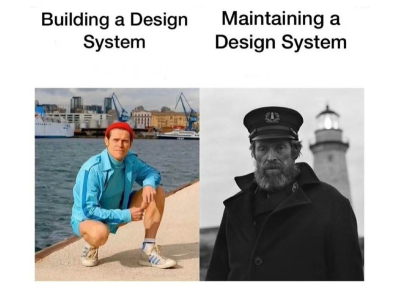
Yes, it requires hard work and vigilance. The time, effort, and heartache you’ll save by having design documentation will be well worth the investment of those same things.
To spare you the suspense, your design documentation isn’t going to be perfect off the bat. There will be mistakes and situations that aren’t accounted for, and that’s fine. Own them. Acknowledge blindspots. Include ways for users to give feedback.
As with most things digital, you’re never really “done.”
Start Small
Such thorough, polished design documentation can almost be deterrents, something only those with deep pockets can make. It may also seem like an unjustifiable investment of time. Neither has to be true.
Documentation of all forms saves time in the long run, and it makes your decisions better. Whether it’s a bash script or a newsletter signup component, you scrutinize it that little bit more when you commit to it as a standard rather than a one-off choice. Let a readme-driven ethos into your heart.
Start small. Choose fonts and colors and show them sitting together nicely on your repo wiki. That’s it! You’re underway. You will grow to care for your design documentation as you care for the project itself because they are part of each other.
Go forth and document!
(yk)


Recent Comments