
Today
While we love the holidays, too much of a seasonal theme can get overwhelming. Thankfully, these design trends strike a nice balance.

The end of the year is right around the corner, and with the holiday season in full force, there’s not a ton of new design launching. However, plenty of fun visuals exist to explore, especially with some seasonally-themed elements.
Here’s what’s trending in design this month:
1. Holiday Skins and Themes
It’s a mainstay this time of year – holiday-themed design elements to help drive sales opportunities. This might be the best part of some of these designs this season – they aren’t covered in red and green color schemes.
Plenty of other colors – including hints of glitter, dark mode designs, and bold pops of color- emphasize the holiday. It’s a fun twist on some classic ideas.
We’ll look at three examples of varying usage for your inspiration.
Designmodo
kicks off the season with a Black Friday landing page that uses a lot of trend elements, including a glitch effect and experimental typography. Nothing about the design screams Christmas like many other holiday designs that you may find. The dark mode theme looks like what you might expect from a digital company, with clear elements that drive you to the offer.

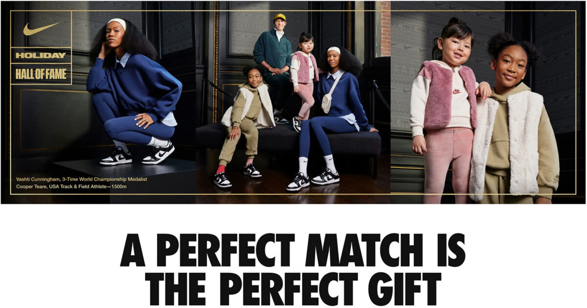
Nike reimagines the holiday theme by picking up on one of the more subtle tones of the season. A gold border, text, and overall set of elements feel special without being overwhelming. The design option is also something you’ve probably come to associate with the brand, which maintains brand identity with special elements for specific events or sales.

Finally, the running brand Oiselle
combines plenty of holiday words and language – “Black Friday,” “Joy,” and “Holiday” but with a nontraditional color palette. It feels fresh and interesting without being too holiday-focused. On the scroll, the site does a good job of highlighting winter/holiday products to add to the overall vibe without feeling too holiday-in-your-face.

2. Neon (Green) Accents
It’s not a holiday theme, but neon green accents are finding a solid presence in many website design projects.
This is not as easy as it sounds. Neon colors can be difficult for a number of reasons – creating enough contrast for readability, getting the brightness just right, or functioning as not to overwhelm the design.
In this iteration of the neon trend, green seems to be the primary color choice. This can be slightly less harsh than yellow or pink and fits into many other color schemes.
Gen Brand uses neon green accents for the action items in the design. They pop against a stark black-and-white aesthetic and quickly draw the eye to guide users. While there’s some additional color usage below the scroll, the neon CTAs remain in effect (and effective).

Francesco Michelini uses a neon green accent in a brutalist theme. There’s a definite readability concern here, but that’s also somewhat common in this design style. Since the neon element is primarily a visual and doesn’t have to be read or clicked, it’s not too concerning.

Retool uses a neon green in the opposite color scheme of the first example but with equal success. With a dark background and white text, the neon elements lead you from branding to calls to action to the main headline, providing a distinct eye-tracking path. Additionally, the green is quite lovely against the black background with the navy animated outline shapes.

3. Sidebar Elements
Homepage sidebars? It’s an element we are seeing a lot more of – even if it is only a design element and not a functional sidebar. (Although we have examples of each here.)
This trend seems to be an evolution of split-screen design elements and is a great way to create a more consistent visual experience between desktop and mobile screens, with the more dominant side of the design being first on mobile with the sidebar below or dropping off completely.
These sidebars can be color swatches that are purely visual, contain interactive content or elements that are vital to the design, or sidebar-style navigation.
Halo Lab has two blocks on the homepage with interactive elements, but the smaller one has a shape distinctive of a sidebar. (Any design that features a 2/3 to 1/3 set of design blocks can have this feel.)

Darina uses a sidebar for branding and navigation elements. This can be a great alternative to a hidden or pop-out menu on desktop-sized screens and then conveniently collapses for mobile devices. The most interesting part of this sidebar-style design is that the sidebar is the element with the most emphasis due to color and a more subdued primary content area.

The portfolio site for Nuno Pereira Sousa uses an orange sidebar for visual impact only. The sidebar adds visual interest and helps create depth for image and text layers. It completely collapses away on mobile, as you might expect. The color choice is nice because readability is consistent between the dark and light sections.

Conclusion
Holiday website design concepts without all the holiday fatigue is something we can really get into this season. Remember, you can create some amazing holiday vibes with subtle changes, colors, and language to get users in the seasonal spirit.
Plus, some of these elements can carry into the new year to help you create visual shifts without feeling the need to do a complete design overhaul with each holiday milestone. Happy holiday designing!


Recent Comments